Use the Flutter inspector
Learn how to use the Flutter inspector to explore a Flutter app's widget tree.
For information on how to locate DevTools screens in different IDEs, check out the DevTools overview.
What is it?
#The Flutter widget inspector is a powerful tool for visualizing and exploring Flutter widget trees. The Flutter framework uses widgets as the core building block for anything from controls (such as text, buttons, and toggles), to layout (such as centering, padding, rows, and columns). The inspector helps you visualize and explore Flutter widget trees, and can be used for the following:
- understanding existing layouts
- diagnosing layout issues
The new Flutter inspector
#As part of Flutter 3.29, the new Flutter inspector is enabled by default. However, it can be disabled from the inspector settings dialog.
Debugging layout issues visually
#The following is a guide to the features available in the inspector's toolbar. When space is limited, the icon is used as the visual version of the label.
-
- Select widget mode
-
Enable this button in order to select a widget on the device to inspect it. To learn more, check out Inspecting a widget.
-
- Show implementation widgets
-
Enable this button in to show implementation widgets in the widget tree. To learn more, check out Use the Widget Tree.
-
 Refresh tree
Reload the current widget info.
-
 Slow animations
Run animations 5 times slower to help fine-tune them.
-
 Show guidelines
Overlay guidelines to assist with fixing layout issues.
-
 Show baselines
-
Show baselines, which are used for aligning text. Can be useful for checking if text is aligned.
-
 Highlight repaints
-
Show borders that change color when elements repaint. Useful for finding unnecessary repaints.
-
 Highlight oversized images
-
Highlights images that are using too much memory by inverting colors and flipping them.
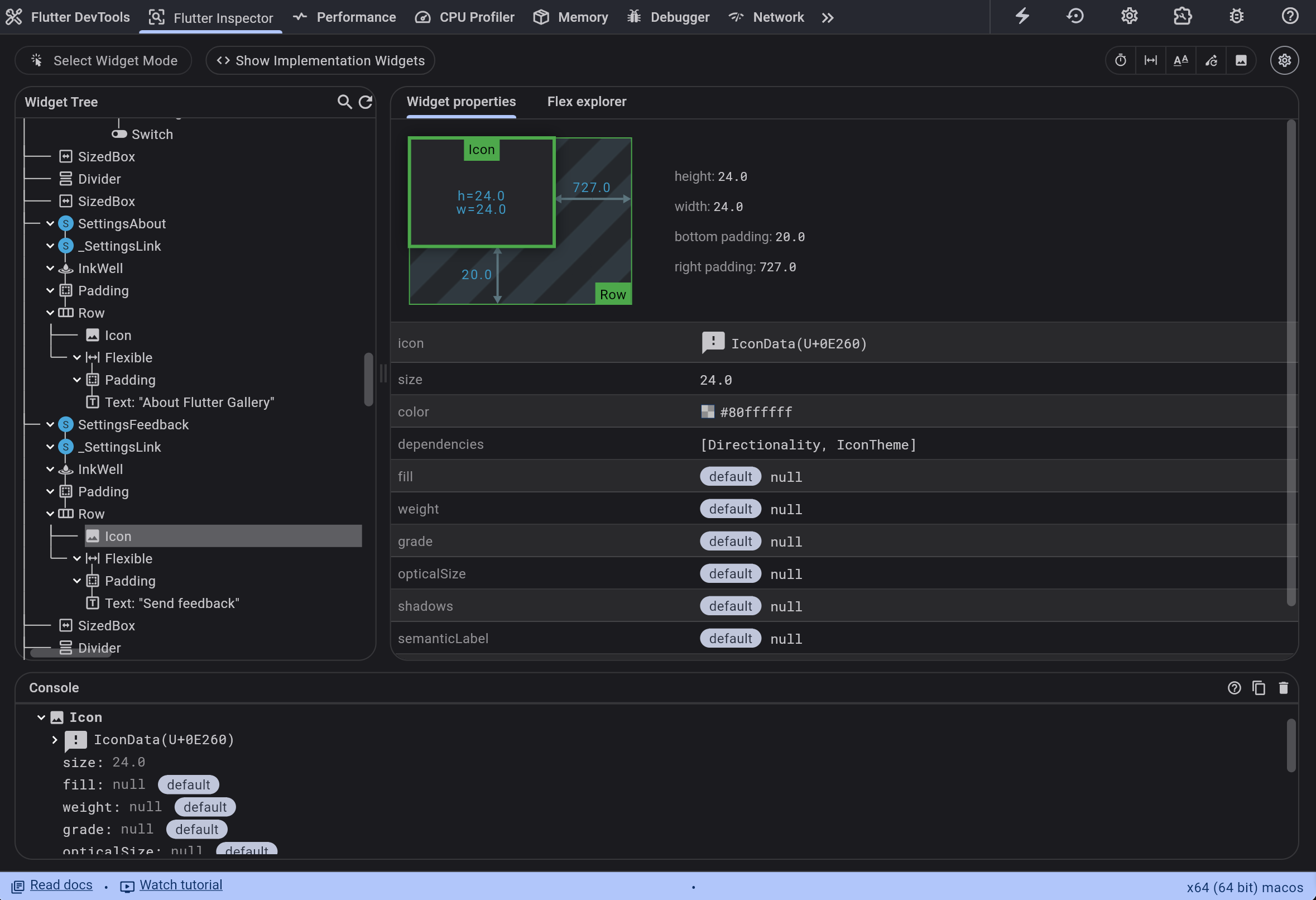
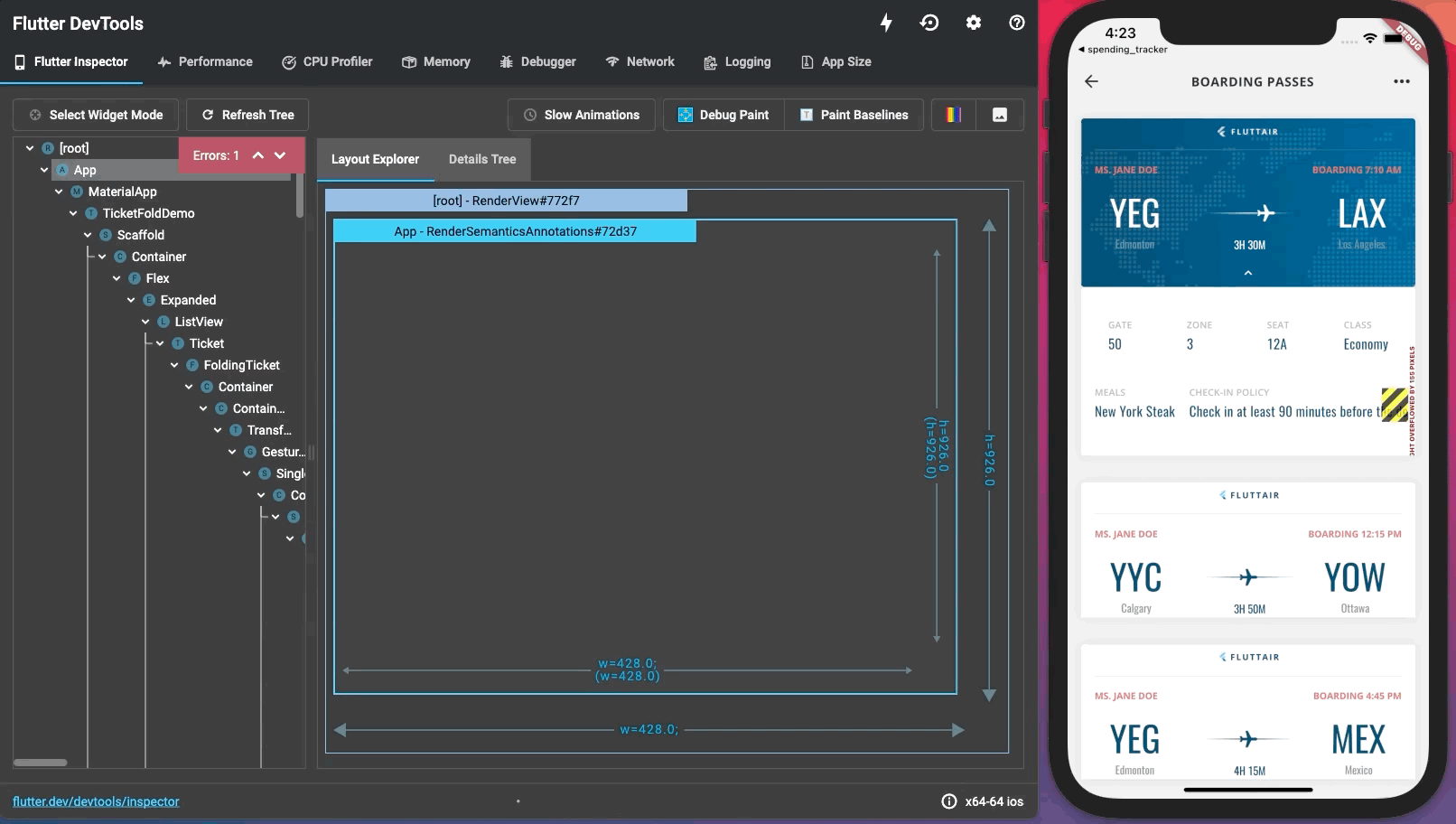
Inspecting a widget
#You can browse the interactive widget tree to view nearby widgets and see their field values.
To locate individual UI elements in the widget tree, click the Select Widget Mode button in the toolbar. This puts the app on the device into a "widget select" mode. Click any widget in the app's UI; this selects the widget on the app's screen, and scrolls the widget tree to the corresponding node. Toggle the Select Widget Mode button again to exit widget select mode.
When debugging layout issues, the key fields to look at are the
size and constraints fields. The constraints flow down the tree,
and the sizes flow back up. For more information on how this works,
see Understanding constraints.
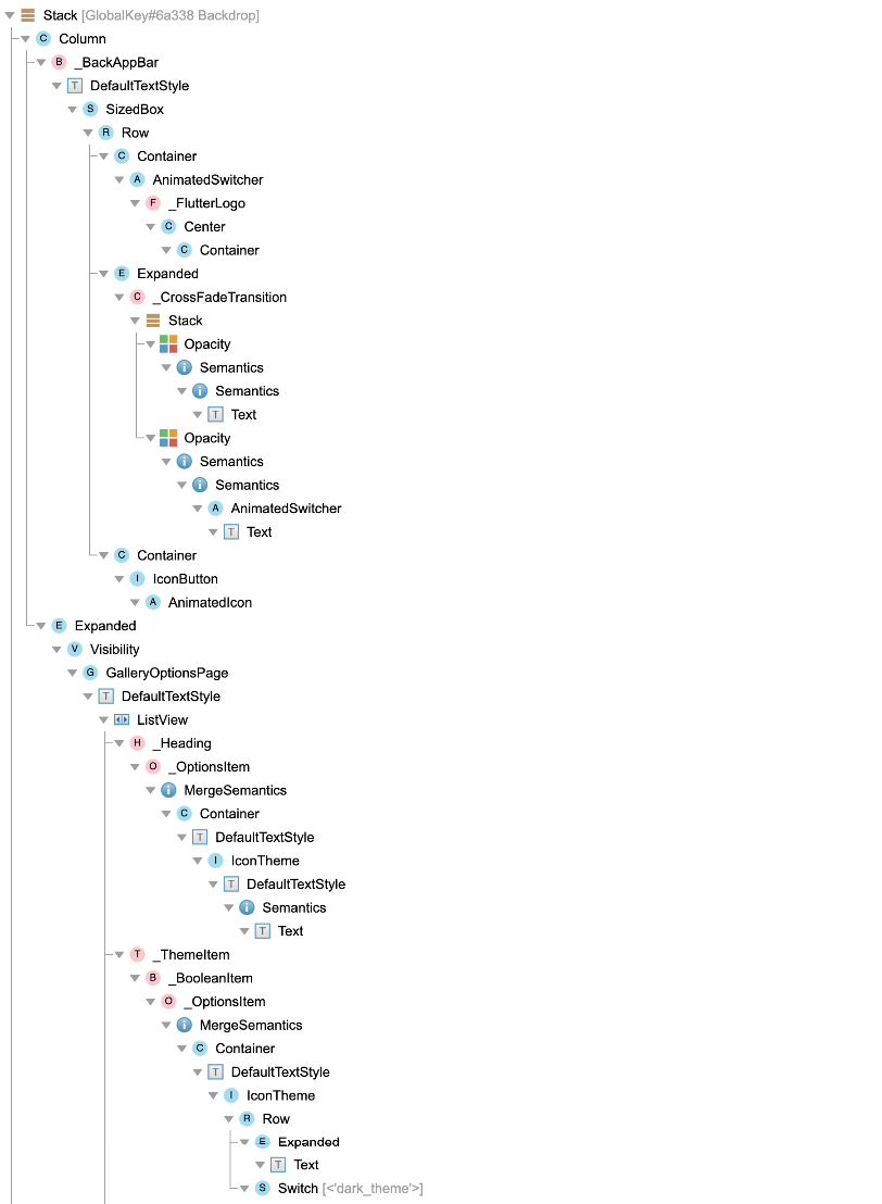
Flutter Widget Tree
#The Flutter Widget Tree allows you to visualize, understand and navigate your app's Widget tree.
Use the Widget Tree
#Viewing widgets created in your project
#By default, the Flutter Widget Tree includes all the widgets created in your root project's directory.
The parent-children relationships of the widgets are represented by a single vertical line (if the parent widget only has a single child) or through indentation (if the parent widget has multiple children.)
For example, for the following section of a widget tree:
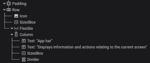
Paddinghas a single childRow-
Rowhas three children:Icon,SizedBox, andFlexible Flexiblehas a single childColumn-
Columnhas four children:Text,Text,SizedBox, andDivider
Viewing all widgets
#To instead view all the widgets in your widget tree, including those that were created outside of your project, toggle on "Show implementation widgets".
The implementation widgets are shown in a lighter font than the widgets created in your project, thereby visually distinguishing them. They are also hidden behind collapsible groups which can be expanded via the inline expand buttons.
For example, here is the same section of a widget tree as above with implementation widgets shown:
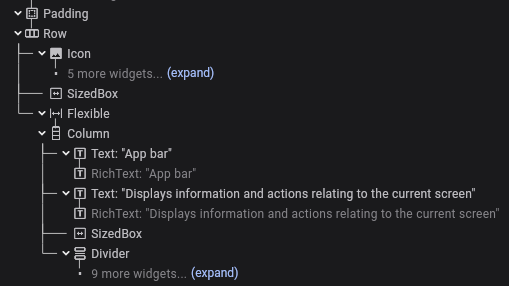
Iconhas five implementation widgets collapsed beneath it- Both
Textwidgets haveRichTextimplementation widget children Dividerhas nine implementation widgets collapsed beneath it
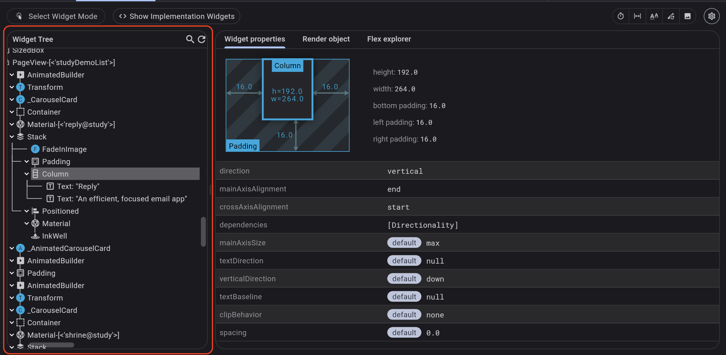
Flutter Widget Explorer
#The Flutter Widget Explorer helps you to better understand the inspected widget.
Use the Widget Explorer
#From the Flutter inspector, select a widget. The Widget Explorer will be shown on the right side of the window.
Depending on the selected widget, the Widget Explorer will include one or more of the following:
- Widget properties tab
- Flex explorer tab
- Render object tab
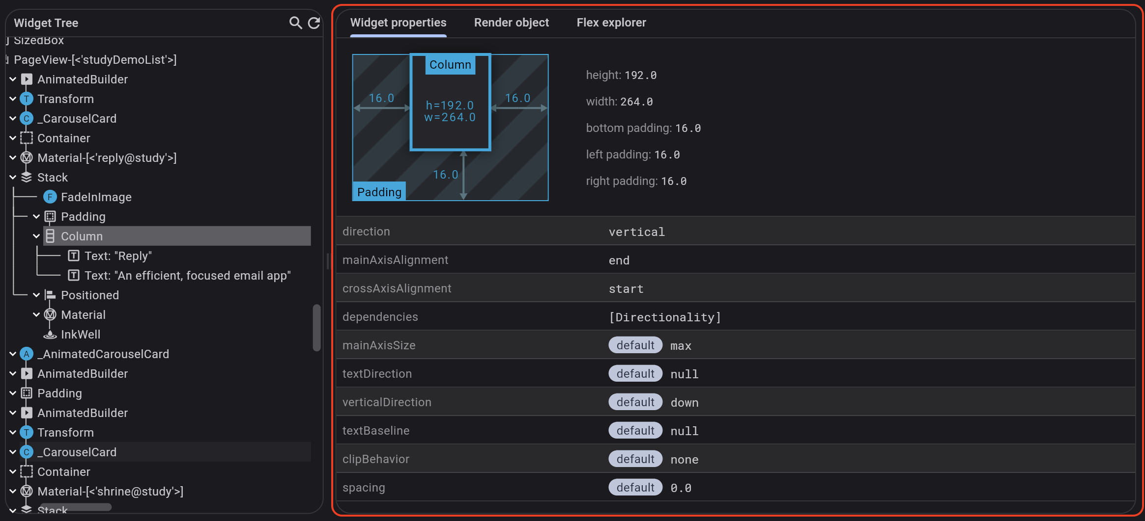
Widget properties tab
#
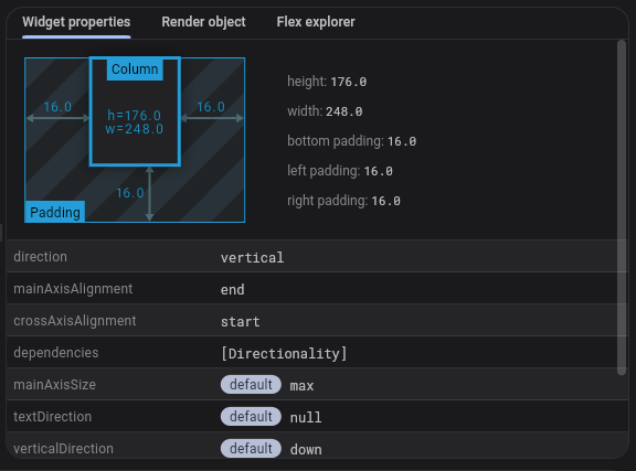
The properties tab shows you mini-view of your widget layout, including width, height, and padding, along with a list of properties on that widget.
These properties include whether or not the value matches the default value for the property argument.
Render object tab
#
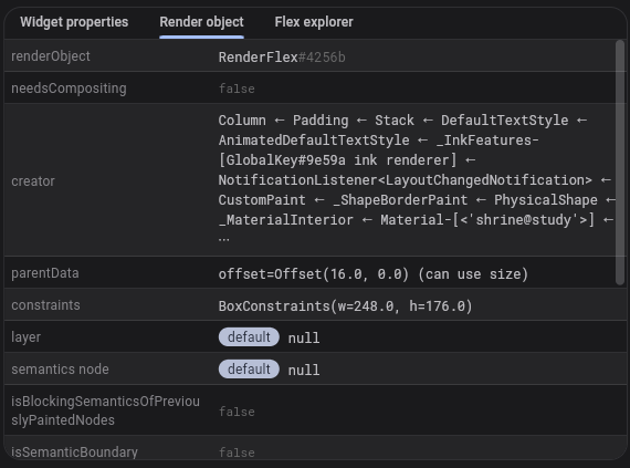
The render object tab displays all the properties set on the render object of the selected Flutter widget.
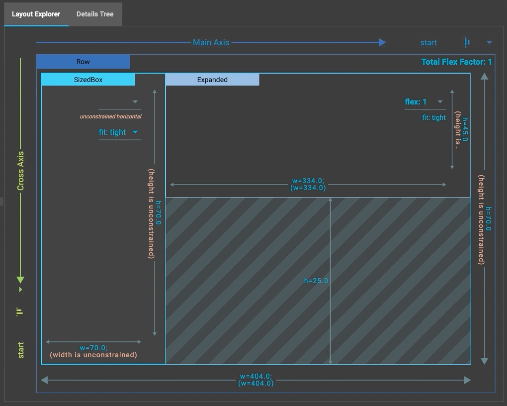
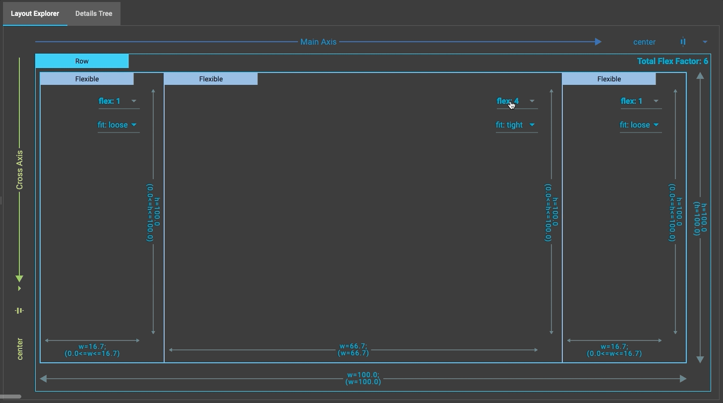
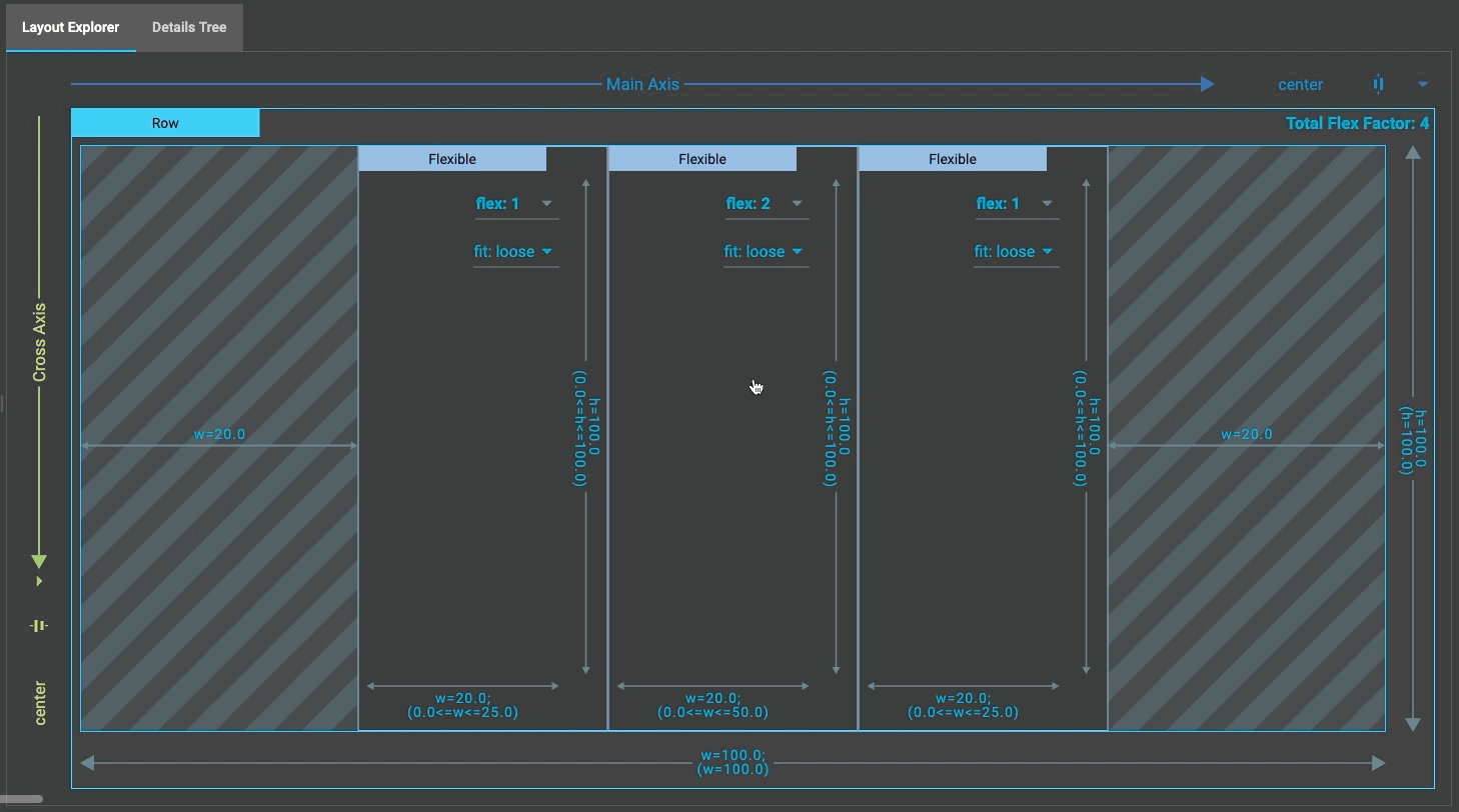
Flex explorer tab
#
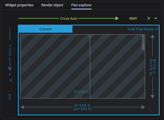
When you select a flex widget (for example, Row,
Column, Flex)
or a direct child of a flex widget, the flex explorer tool will
appear in the Widget Explorer.
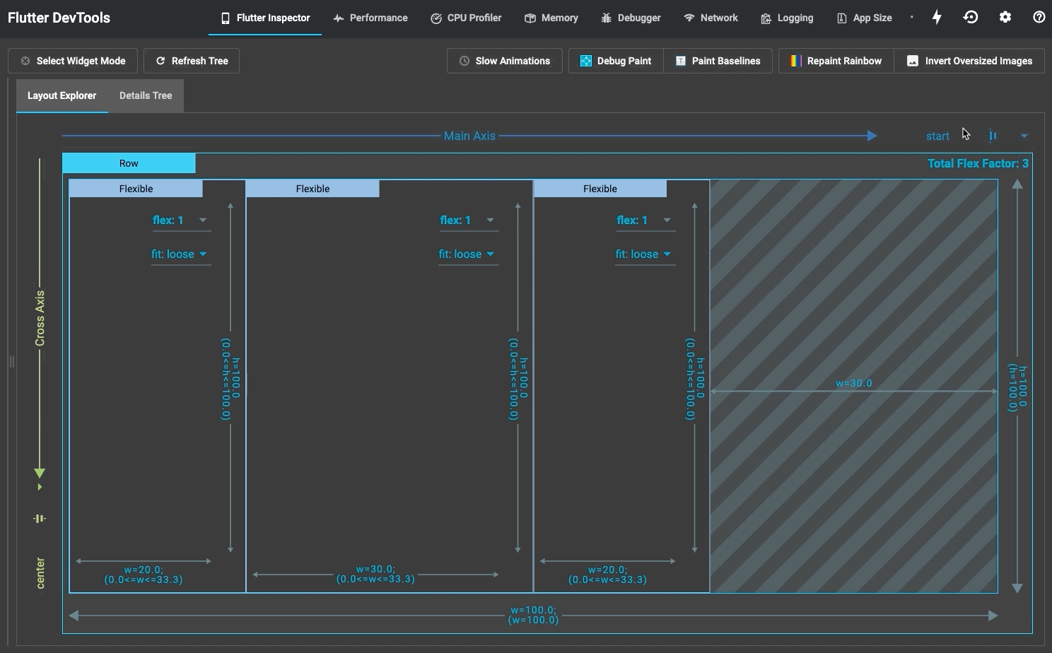
The flex explorer tool visualizes how Flex
widgets and their
children are laid out. The explorer identifies the main axis
and cross axis, as well as the current alignment for each
(for example, start, end, and spaceBetween).
It also shows details like flex factor, flex fit, and layout
constraints.
Additionally, the explorer shows layout constraint violations and render overflow errors. Violated layout constraints are colored red, and overflow errors are presented in the standard "yellow-tape" pattern, as you might see on a running device. These visualizations aim to improve understanding of why overflow errors occur as well as how to fix them.
Clicking a widget in the flex explorer mirrors the selection on the on-device inspector. Select Widget Mode needs to be enabled for this. To enable it, click on the Select Widget Mode button in the inspector.
For some properties, like flex factor, flex fit, and alignment, you can modify the value via dropdown lists in the explorer. When modifying a widget property, you see the new value reflected not only in the flex explorer, but also on the device running your Flutter app. The explorer animates on property changes so that the effect of the change is clear. Widget property changes made from the layout explorer don't modify your source code and are reverted on hot reload.
Interactive Properties
#
The flex explorer supports modifying mainAxisAlignment,
crossAxisAlignment, and
FlexParentData.flex.
In the future, we may add support for additional properties
such as mainAxisSize,
textDirection, and
FlexParentData.fit.
mainAxisAlignment
Supported values:
MainAxisAlignment.startMainAxisAlignment.endMainAxisAlignment.centerMainAxisAlignment.spaceBetweenMainAxisAlignment.spaceAroundMainAxisAlignment.spaceEvenly
crossAxisAlignment
Supported values:
CrossAxisAlignment.startCrossAxisAlignment.centerCrossAxisAlignment.endCrossAxisAlignment.stretch
FlexParentData.flex
The flex explorer supports 7 flex options in the UI (null, 0, 1, 2, 3, 4, 5), but technically the flex factor of a flex widget's child can be any int.
Flexible.fit
The flex explorer supports the two different types of
FlexFit:
loose and tight.
Visual debugging
#The Flutter Inspector provides several options for visually debugging your app.

Slow animations
#When enabled, this option runs animations 5 times slower for easier visual inspection. This can be useful if you want to carefully observe and tweak an animation that doesn't look quite right.
This can also be set in code:
import 'package:flutter/scheduler.dart';
void setSlowAnimations() {
timeDilation = 5.0;
}
This slows the animations by 5x.
See also
#The following links provide more info.
The following screen recordings show before and after slowing an animation.

Show guidelines
#This feature draws guidelines over your app that display render boxes, alignments, paddings, scroll views, clippings and spacers.
This tool can be used for better understanding your layout. For instance, by finding unwanted padding or understanding widget alignment.
You can also enable this in code:
import 'package:flutter/rendering.dart';
void showLayoutGuidelines() {
debugPaintSizeEnabled = true;
}
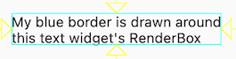
Render boxes
#Widgets that draw to the screen create a render box, the building blocks of Flutter layouts. They're shown with a bright blue border:
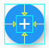
Alignments
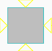
#Alignments are shown with yellow arrows. These arrows show the vertical and horizontal offsets of a widget relative to its parent. For example, this button's icon is shown as being centered by the four arrows:
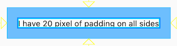
Padding
#Padding is shown with a semi-transparent blue background:
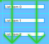
Scroll views
#Widgets with scrolling contents (such as list views) are shown with green arrows:
Clipping
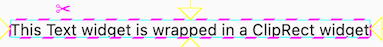
#Clipping, for example when using the ClipRect widget, are shown with a dashed pink line with a scissors icon:
Spacers
#
Spacer widgets are shown with a grey background,
such as this SizedBox without a child:
Show baselines
#This option makes all baselines visible. Baselines are horizontal lines used to position text.
This can be useful for checking whether text is precisely aligned vertically. For example, the text baselines in the following screenshot are slightly misaligned:

The Baseline widget can be used to adjust baselines.
A line is drawn on any render box that has a baseline set; alphabetic baselines are shown as green and ideographic as yellow.
You can also enable this in code:
import 'package:flutter/rendering.dart';
void showBaselines() {
debugPaintBaselinesEnabled = true;
}
Highlight repaints
#This option draws a border around all render boxes that changes color every time that box repaints.
This rotating rainbow of colors is useful for finding parts of your app that are repainting too often and potentially harming performance.
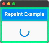
For example, one small animation could be causing an entire page to repaint on every frame. Wrapping the animation in a RepaintBoundary widget limits the repainting to just the animation.
Here the progress indicator causes its container to repaint:
class EverythingRepaintsPage extends StatelessWidget {
const EverythingRepaintsPage({super.key});
@override
Widget build(BuildContext context) {
return Scaffold(
appBar: AppBar(title: const Text('Repaint Example')),
body: const Center(child: CircularProgressIndicator()),
);
}
}
Wrapping the progress indicator in a RepaintBoundary causes
only that section of the screen to repaint:
class AreaRepaintsPage extends StatelessWidget {
const AreaRepaintsPage({super.key});
@override
Widget build(BuildContext context) {
return Scaffold(
appBar: AppBar(title: const Text('Repaint Example')),
body: const Center(
child: RepaintBoundary(child: CircularProgressIndicator()),
),
);
}
}
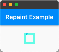
RepaintBoundary widgets have tradeoffs. They can help with performance,
but they also have an overhead of creating a new canvas,
which uses additional memory.
You can also enable this option in code:
import 'package:flutter/rendering.dart';
void highlightRepaints() {
debugRepaintRainbowEnabled = true;
}
Highlight oversized images
#This option highlights images that are too large by both inverting their colors and flipping them vertically:
The highlighted images use more memory than is required; for example, a large 5MB image displayed at 100 by 100 pixels.
Such images can cause poor performance, especially on lower-end devices and when you have many images, as in a list view, this performance hit can add up. Information about each image is printed in the debug console:
dash.png has a display size of 213×392 but a decode size of 2130×392, which uses an additional 2542KB.
Images are deemed too large if they use at least 128KB more than required.
Fixing images
#Wherever possible, the best way to fix this problem is resizing the image asset file so it's smaller.
If this isn't possible, you can use the cacheHeight and cacheWidth
parameters on the Image constructor:
class ResizedImage extends StatelessWidget {
const ResizedImage({super.key});
@override
Widget build(BuildContext context) {
return Image.asset('dash.png', cacheHeight: 213, cacheWidth: 392);
}
}
This makes the engine decode this image at the specified size, and reduces memory usage (decoding and storage is still more expensive than if the image asset itself was shrunk). The image is rendered to the constraints of the layout or width and height regardless of these parameters.
This property can also be set in code:
void showOversizedImages() {
  debugInvertOversizedImages = true;
}
More information
#You can learn more at the following link:
Track widget creation
#Part of the functionality of the Flutter inspector is based on instrumenting the application code in order to better understand the source locations where widgets are created. The source instrumentation allows the Flutter inspector to present the widget tree in a manner similar to how the UI was defined in your source code. Without it, the tree of nodes in the widget tree are much deeper, and it can be more difficult to understand how the runtime widget hierarchy corresponds to your application's UI.
You can disable this feature by passing --no-track-widget-creation to
the flutter run command.
Here are examples of what your widget tree might look like with and without track widget creation enabled.
Track widget creation enabled (default):
Track widget creation disabled (not recommended):
This feature prevents otherwise-identical const Widgets from
being considered equal in debug builds. For more details, see
the discussion on common problems when debugging.
Inspector settings
#
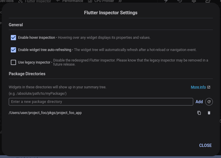
Enable hover inspection
#Hovering over any widget displays its properties and values.
Toggling this value enables or disables the hover inspection functionality.
Enable widget tree auto-refreshing
#When enabled, the widget tree automatically refreshes after a hot-reload or a navigation event.
Use legacy inspector
#When enabled, use the legacy inspector instead of the new inspector.
Package directories
#By default, DevTools limits the widgets displayed in the widget tree to those created in the project's root directory. To see all widgets, including those created outside of a project's root directory, toggle on Show implementation widgets
In order to include other widgets in the default widget tree, a parent directory of theirs must be added to the Package Directories.
For example, consider the following directory structure:
project_foo
  pkgs
    project_foo_app
    widgets_A
    widgets_B
Running your app from project_foo_app displays only widgets from
project_foo/pkgs/project_foo_app in the widget inspector tree.
To show widgets from widgets_A in the widget tree,
add project_foo/pkgs/widgets_A to the package directories.
To display all widgets from your project root in the widget tree,
add project_foo to the package directories.
Changes to your package directories persist the next time the widget inspector is opened for the app.
Other resources
#For a demonstration of what's generally possible with the inspector, see the DartConf 2018 talk demonstrating the IntelliJ version of the Flutter inspector.
To learn how to visually debug layout issues using DevTools, check out a guided Flutter Inspector tutorial.
Unless stated otherwise, the documentation on this site reflects Flutter 3.44.7. Page last updated on 2026-05-11. View source or report an issue.