# Add interactivity to your Flutter app
> How to implement a stateful widget that responds to taps.
:::secondary What you'll learn
* How to respond to taps.
* How to create a custom widget.
* The difference between stateless and stateful widgets.
:::
How do you modify your app to make it react to user input?
In this tutorial, you'll add interactivity to an app that
contains only non-interactive widgets.
Specifically, you'll modify an icon to make it tappable
by creating a custom stateful widget that manages two
stateless widgets.
The [building layouts tutorial][] showed you how to create
the layout for the following screenshot.
When the app first launches, the star is solid red,
indicating that this lake has previously been favorited.
The number next to the star indicates that 41
people have favorited this lake. After completing this tutorial,
tapping the star removes its favorited status,
replacing the solid star with an outline and
decreasing the count. Tapping again favorites the lake,
drawing a solid star and increasing the count.
To accomplish this, you'll create a single custom widget
that includes both the star and the count,
which are themselves widgets. Tapping the star changes state
for both widgets, so the same widget should manage both.
You can get right to touching the code in
[Step 2: Subclass StatefulWidget](#step-2).
If you want to try different ways of managing state,
skip to [Managing state][].
## Stateful and stateless widgets
A widget is either stateful or stateless. If a widget can
change—when a user interacts with it,
for example—it's stateful.
A _stateless_ widget never changes.
[`Icon`][], [`IconButton`][], and [`Text`][] are
examples of stateless widgets. Stateless widgets
subclass [`StatelessWidget`][].
A _stateful_ widget is dynamic: for example,
it can change its appearance in response to events
triggered by user interactions or when it receives data.
[`Checkbox`][], [`Radio`][], [`Slider`][],
[`InkWell`][], [`Form`][], and [`TextField`][]
are examples of stateful widgets. Stateful widgets
subclass [`StatefulWidget`][].
A widget's state is stored in a [`State`][] object,
separating the widget's state from its appearance.
The state consists of values that can change, like a
slider's current value or whether a checkbox is checked.
When the widget's state changes,
the state object calls `setState()`,
telling the framework to redraw the widget.
## Creating a stateful widget
:::secondary What's the point?
* A stateful widget is implemented by two classes:
a subclass of `StatefulWidget` and a subclass of `State`.
* The state class contains the widget's mutable state and
the widget's `build()` method.
* When the widget's state changes, the state object calls
`setState()`, telling the framework to redraw the widget.
:::
In this section, you'll create a custom stateful widget.
You'll replace two stateless widgets—the solid red
star and the numeric count next to it—with a single
custom stateful widget that manages a row with two
children widgets: an `IconButton` and `Text`.
Implementing a custom stateful widget requires creating two classes:
* A subclass of `StatefulWidget` that defines the widget.
* A subclass of `State` that contains the state for that
widget and defines the widget's `build()` method.
This section shows you how to build a stateful widget,
called `FavoriteWidget`, for the lakes app.
After setting up, your first step is choosing how state is
managed for `FavoriteWidget`.
### Step 0: Get ready
If you've already built the app in the
[building layouts tutorial][],
skip to the next section.
1. Make sure you've [set up][] your environment.
1. [Create a new Flutter app][new-flutter-app].
1. Replace the `lib/main.dart` file with [`main.dart`][].
1. Replace the `pubspec.yaml` file with [`pubspec.yaml`][].
1. Create an `images` directory in your project, and add
[`lake.jpg`][].
Once you have a connected and enabled device,
or you've launched the [iOS simulator][]
(part of the Flutter install) or the
[Android emulator][] (part of the Android Studio
install), you are good to go!
### Step 1: Decide which object manages the widget's state
A widget's state can be managed in several ways,
but in our example the widget itself,
`FavoriteWidget`, will manage its own state.
In this example, toggling the star is an isolated
action that doesn't affect the parent widget or the rest of
the UI, so the widget can handle its state internally.
Learn more about the separation of widget and state,
and how state might be managed, in [Managing state][].
### Step 2: Subclass StatefulWidget
The `FavoriteWidget` class manages its own state,
so it overrides `createState()` to create a `State`
object. The framework calls `createState()`
when it wants to build the widget.
In this example, `createState()` returns an
instance of `_FavoriteWidgetState`,
which you'll implement in the next step.
```dart
class FavoriteWidget extends StatefulWidget {
const FavoriteWidget({super.key});
@override
State createState() => _FavoriteWidgetState();
}
```
:::note
Members or classes that start with an underscore
(`_`) are private. For more information,
see [Libraries and imports][], a section in the
[Dart language documentation][].
:::
### Step 3: Subclass State
The `_FavoriteWidgetState` class stores the mutable data
that can change over the lifetime of the widget.
When the app first launches, the UI displays a solid
red star, indicating that the lake has "favorite" status,
along with 41 likes. These values are stored in the
`_isFavorited` and `_favoriteCount` fields:
```dart
class _FavoriteWidgetState extends State {
[!bool _isFavorited = true;!]
[!int _favoriteCount = 41;!]
```
The class also defines a `build()` method,
which creates a row containing a red `IconButton`,
and `Text`. You use [`IconButton`][] (instead of `Icon`)
because it has an `onPressed` property that defines
the callback function (`_toggleFavorite`) for handling a tap.
You'll define the callback function next.
```dart
class _FavoriteWidgetState extends State {
// ···
@override
Widget [!build!](BuildContext context) {
return Row(
mainAxisSize: MainAxisSize.min,
children: [
Container(
padding: const EdgeInsets.all(0),
child: IconButton(
padding: const EdgeInsets.all(0),
alignment: Alignment.center,
[!icon: (_isFavorited!]
? const Icon(Icons.star)
: const Icon(Icons.star_border)),
color: Colors.red[500],
[!onPressed: _toggleFavorite,!]
),
),
SizedBox(width: 18, child: SizedBox([!child: Text('$_favoriteCount'))),!]
],
);
}
// ···
}
```
:::tip
Placing the `Text` in a [`SizedBox`][] and setting its
width prevents a discernible "jump" when the text changes
between the values of 40 and 41 — a jump would
otherwise occur because those values have different widths.
:::
The `_toggleFavorite()` method, which is called when the
`IconButton` is pressed, calls `setState()`.
Calling `setState()` is critical, because this
tells the framework that the widget's state has
changed and that the widget should be redrawn.
The function argument to `setState()` toggles the
UI between these two states:
* A `star` icon and the number 41
* A `star_border` icon and the number 40
```dart
void _toggleFavorite() {
setState(() {
if (_isFavorited) {
_favoriteCount -= 1;
_isFavorited = false;
} else {
_favoriteCount += 1;
_isFavorited = true;
}
});
}
```
### Step 4: Plug the stateful widget into the widget tree
Add your custom stateful widget to the widget tree in
the app's `build()` method. First, locate the code that
creates the `Icon` and `Text`, and delete it.
In the same location, create the stateful widget:
```dart diff
child: Row(
children: [
// ...
- Icon(
- Icons.star,
- color: Colors.red[500],
- ),
- const Text('41'),
+ const FavoriteWidget(),
],
),
```
That's it! When you hot reload the app,
the star icon should now respond to taps.
### Problems?
If you can't get your code to run, look in your
IDE for possible errors. [Debugging Flutter apps][] might help.
If you still can't find the problem,
check your code against the interactive lakes example on GitHub.
* [`lib/main.dart`](https://github.com/flutter/website/tree/main/examples/layout/lakes/interactive/lib/main.dart)
* [`pubspec.yaml`](https://github.com/flutter/website/tree/main/examples/layout/lakes/interactive/pubspec.yaml)
* [`lakes.jpg`](https://github.com/flutter/website/tree/main/examples/layout/lakes/interactive/images/lake.jpg)
If you still have questions, refer to any one of the developer
[community][] channels.
---
The rest of this page covers several ways a widget's state can
be managed, and lists other available interactive widgets.
## Managing state
:::secondary What's the point?
* There are different approaches for managing state.
* You, as the widget designer, choose which approach to use.
* If in doubt, start by managing state in the parent widget.
:::
Who manages the stateful widget's state? The widget itself?
The parent widget? Both? Another object?
The answer is... it depends. There are several valid ways
to make your widget interactive. You, as the widget designer,
make the decision based on how you expect your widget to be used.
Here are the most common ways to manage state:
* [The widget manages its own state](#self-managed)
* [The parent manages the widget's state](#parent-managed)
* [A mix-and-match approach](#mix-and-match)
How do you decide which approach to use?
The following principles should help you decide:
* If the state in question is user data,
for example the checked or unchecked
mode of a checkbox, or the position of a slider,
then the state is best managed by the parent widget.
* If the state in question is aesthetic,
for example an animation, then the
state is best managed by the widget itself.
If in doubt, start by managing state in the parent widget.
We'll give examples of the different ways of managing state
by creating three simple examples: TapboxA, TapboxB,
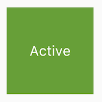
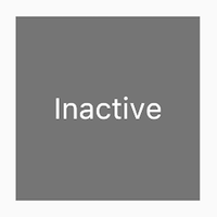
and TapboxC. The examples all work similarly—each
creates a container that, when tapped, toggles between a
green or grey box. The `_active` boolean determines the
color: green for active or grey for inactive.
These examples use [`GestureDetector`][] to capture activity
on the `Container`.
### The widget manages its own state
Sometimes it makes the most sense for the widget
to manage its state internally. For example,
[`ListView`][] automatically scrolls when its
content exceeds the render box. Most developers
using `ListView` don't want to manage `ListView`'s
scrolling behavior, so `ListView` itself manages its scroll offset.
The `_TapboxAState` class:
* Manages state for `TapboxA`.
* Defines the `_active` boolean which determines the
box's current color.
* Defines the `_handleTap()` function, which updates
`_active` when the box is tapped and calls the
`setState()` function to update the UI.
* Implements all interactive behavior for the widget.
```dart
import 'package:flutter/material.dart';
// TapboxA manages its own state.
//------------------------- TapboxA ----------------------------------
class TapboxA extends StatefulWidget {
const TapboxA({super.key});
@override
State createState() => _TapboxAState();
}
class _TapboxAState extends State {
bool _active = false;
void _handleTap() {
setState(() {
_active = !_active;
});
}
@override
Widget build(BuildContext context) {
return GestureDetector(
onTap: _handleTap,
child: Container(
width: 200,
height: 200,
decoration: BoxDecoration(
color: _active ? Colors.lightGreen[700] : Colors.grey[600],
),
child: Center(
child: Text(
_active ? 'Active' : 'Inactive',
style: const TextStyle(fontSize: 32, color: Colors.white),
),
),
),
);
}
}
//------------------------- MyApp ----------------------------------
class MyApp extends StatelessWidget {
const MyApp({super.key});
@override
Widget build(BuildContext context) {
return MaterialApp(
title: 'Flutter Demo',
home: Scaffold(
appBar: AppBar(title: const Text('Flutter Demo')),
body: const Center(child: TapboxA()),
),
);
}
}
```
### The parent widget manages the widget's state
Often it makes the most sense for the parent widget
to manage the state and tell its child widget when to update.
For example, [`IconButton`][] allows you to treat
an icon as a tappable button. `IconButton` is a
stateless widget because we decided that the parent
widget needs to know whether the button has been tapped,
so it can take appropriate action.
In the following example, TapboxB exports its state
to its parent through a callback. Because TapboxB
doesn't manage any state, it subclasses StatelessWidget.
The ParentWidgetState class:
* Manages the `_active` state for TapboxB.
* Implements `_handleTapboxChanged()`,
the method called when the box is tapped.
* When the state changes, calls `setState()`
to update the UI.
The TapboxB class:
* Extends StatelessWidget because all state is handled by its parent.
* When a tap is detected, it notifies the parent.
```dart
import 'package:flutter/material.dart';
// ParentWidget manages the state for TapboxB.
//------------------------ ParentWidget --------------------------------
class ParentWidget extends StatefulWidget {
const ParentWidget({super.key});
@override
State createState() => _ParentWidgetState();
}
class _ParentWidgetState extends State {
bool _active = false;
void _handleTapboxChanged(bool newValue) {
setState(() {
_active = newValue;
});
}
@override
Widget build(BuildContext context) {
return SizedBox(
child: TapboxB(active: _active, onChanged: _handleTapboxChanged),
);
}
}
//------------------------- TapboxB ----------------------------------
class TapboxB extends StatelessWidget {
const TapboxB({super.key, this.active = false, required this.onChanged});
final bool active;
final ValueChanged onChanged;
void _handleTap() {
onChanged(!active);
}
@override
Widget build(BuildContext context) {
return GestureDetector(
onTap: _handleTap,
child: Container(
width: 200,
height: 200,
decoration: BoxDecoration(
color: active ? Colors.lightGreen[700] : Colors.grey[600],
),
child: Center(
child: Text(
active ? 'Active' : 'Inactive',
style: const TextStyle(fontSize: 32, color: Colors.white),
),
),
),
);
}
}
```
### A mix-and-match approach
For some widgets, a mix-and-match approach makes
the most sense. In this scenario, the stateful widget
manages some of the state, and the parent widget
manages other aspects of the state.
In the `TapboxC` example, on tap down,
a dark green border appears around the box. On tap up,
the border disappears and the box's color changes. `TapboxC`
exports its `_active` state to its parent but manages its
`_highlight` state internally. This example has two `State`
objects, `_ParentWidgetState` and `_TapboxCState`.
The `_ParentWidgetState` object:
* Manages the `_active` state.
* Implements `_handleTapboxChanged()`,
the method called when the box is tapped.
* Calls `setState()` to update the UI when a tap
occurs and the `_active` state changes.
The `_TapboxCState` object:
* Manages the `_highlight` state.
* The `GestureDetector` listens to all tap events.
As the user taps down, it adds the highlight
(implemented as a dark green border). As the user releases the
tap, it removes the highlight.
* Calls `setState()` to update the UI on tap down,
tap up, or tap cancel, and the `_highlight` state changes.
* On a tap event, passes that state change to the parent widget to take
appropriate action using the [`widget`][] property.
```dart
import 'package:flutter/material.dart';
//---------------------------- ParentWidget ----------------------------
class ParentWidget extends StatefulWidget {
const ParentWidget({super.key});
@override
State createState() => _ParentWidgetState();
}
class _ParentWidgetState extends State {
bool _active = false;
void _handleTapboxChanged(bool newValue) {
setState(() {
_active = newValue;
});
}
@override
Widget build(BuildContext context) {
return SizedBox(
child: TapboxC(active: _active, onChanged: _handleTapboxChanged),
);
}
}
//----------------------------- TapboxC ------------------------------
class TapboxC extends StatefulWidget {
const TapboxC({super.key, this.active = false, required this.onChanged});
final bool active;
final ValueChanged onChanged;
@override
State createState() => _TapboxCState();
}
class _TapboxCState extends State {
bool _highlight = false;
void _handleTapDown(TapDownDetails details) {
setState(() {
_highlight = true;
});
}
void _handleTapUp(TapUpDetails details) {
setState(() {
_highlight = false;
});
}
void _handleTapCancel() {
setState(() {
_highlight = false;
});
}
void _handleTap() {
widget.onChanged(!widget.active);
}
@override
Widget build(BuildContext context) {
// This example adds a green border on tap down.
// On tap up, the square changes to the opposite state.
return GestureDetector(
onTapDown: _handleTapDown, // Handle the tap events in the order that
onTapUp: _handleTapUp, // they occur: down, up, tap, cancel
onTap: _handleTap,
onTapCancel: _handleTapCancel,
child: Container(
width: 200,
height: 200,
decoration: BoxDecoration(
color: widget.active ? Colors.lightGreen[700] : Colors.grey[600],
border: _highlight
? Border.all(color: Colors.teal[700]!, width: 10)
: null,
),
child: Center(
child: Text(
widget.active ? 'Active' : 'Inactive',
style: const TextStyle(fontSize: 32, color: Colors.white),
),
),
),
);
}
}
```
An alternate implementation might have exported the highlight
state to the parent while keeping the active state internal,
but if you asked someone to use that tap box,
they'd probably complain that it doesn't make much sense.
The developer cares whether the box is active.
The developer probably doesn't care how the highlighting
is managed, and prefers that the tap box handles those
details.
## Other interactive widgets
Flutter offers a variety of buttons and similar interactive widgets.
Most of these widgets implement the [Material Design guidelines][],
which define a set of components with an opinionated UI.
If you prefer, you can use [`GestureDetector`][] to build
interactivity into any custom widget.
You can find examples of `GestureDetector` in
[Managing state][]. Learn more about the `GestureDetector`
in [Handle taps][], a recipe in the Flutter cookbook.
:::tip
Flutter also provides a set of iOS-style widgets called
[`Cupertino`][].
:::
When you need interactivity, it's easiest to use one of
the prefabricated widgets. Here's a partial list:
### Standard widgets
* [`Form`][]
* [`FormField`][]
### Material Components
* [`Checkbox`][]
* [`DropdownButton`][]
* [`TextButton`][]
* [`FloatingActionButton`][]
* [`IconButton`][]
* [`Radio`][]
* [`ElevatedButton`][]
* [`Slider`][]
* [`Switch`][]
* [`TextField`][]
## Resources
The following resources might help when adding interactivity
to your app.
[Gestures][], a section in the Flutter cookbook.
[Handling gestures][]
: How to create a button and make it respond to input.
[Gestures in Flutter][]
: A description of Flutter's gesture mechanism.
[Flutter API documentation][]
: Reference documentation for all of the Flutter libraries.
Wonderous app [running app][wonderous-app], [repo][wonderous-repo]
: Flutter showcase app with a custom design and engaging interactions.
[Flutter's Layered Design][] (video)
: This video includes information about state and
stateless widgets. Presented by Google engineer, Ian Hickson.
[Android emulator]: /platform-integration/android/setup#set-up-devices
[`Checkbox`]: https://api.flutter.dev/flutter/material/Checkbox-class.html
[`Cupertino`]: https://api.flutter.dev/flutter/cupertino/cupertino-library.html
[Dart language documentation]: https://dart.dev/language
[Debugging Flutter apps]: /testing/debugging
[`DropdownButton`]: https://api.flutter.dev/flutter/material/DropdownButton-class.html
[`TextButton`]: https://api.flutter.dev/flutter/material/TextButton-class.html
[`FloatingActionButton`]: https://api.flutter.dev/flutter/material/FloatingActionButton-class.html
[Flutter API documentation]: https://api.flutter.dev
[Flutter's Layered Design]: https://www.youtube.com/watch?v=dkyY9WCGMi0
[`FormField`]: https://api.flutter.dev/flutter/widgets/FormField-class.html
[`Form`]: https://api.flutter.dev/flutter/widgets/Form-class.html
[`GestureDetector`]: https://api.flutter.dev/flutter/widgets/GestureDetector-class.html
[Gestures]: /cookbook/gestures
[Gestures in Flutter]: /ui/interactivity/gestures
[Handling gestures]: /ui#handling-gestures
[new-flutter-app]: /reference/create-new-app
[`IconButton`]: https://api.flutter.dev/flutter/material/IconButton-class.html
[`Icon`]: https://api.flutter.dev/flutter/widgets/Icon-class.html
[`InkWell`]: https://api.flutter.dev/flutter/material/InkWell-class.html
[iOS simulator]: /platform-integration/ios/setup#set-up-devices
[building layouts tutorial]: /ui/layout/tutorial
[community]: https://flutter.dev/community
[Handle taps]: /cookbook/gestures/handling-taps
[`lake.jpg`]: https://github.com/flutter/website/blob/main/examples/layout/lakes/step6/images/lake.jpg
[Libraries and imports]: https://dart.dev/language/libraries
[`ListView`]: https://api.flutter.dev/flutter/widgets/ListView-class.html
[`main.dart`]: https://github.com/flutter/website/blob/main/examples/layout/lakes/step6/lib/main.dart
[Managing state]: #managing-state
[Material Design guidelines]: https://m3.material.io/styles
[`pubspec.yaml`]: https://github.com/flutter/website/blob/main/examples/layout/lakes/step6/pubspec.yaml
[`Radio`]: https://api.flutter.dev/flutter/material/Radio-class.html
[`ElevatedButton`]: https://api.flutter.dev/flutter/material/ElevatedButton-class.html
[wonderous-app]: https://wonderous.app//web
[wonderous-repo]: https://github.com/gskinnerTeam/flutter-wonderous-app
[set up]: /install
[`SizedBox`]: https://api.flutter.dev/flutter/widgets/SizedBox-class.html
[`Slider`]: https://api.flutter.dev/flutter/material/Slider-class.html
[`State`]: https://api.flutter.dev/flutter/widgets/State-class.html
[`StatefulWidget`]: https://api.flutter.dev/flutter/widgets/StatefulWidget-class.html
[`StatelessWidget`]: https://api.flutter.dev/flutter/widgets/StatelessWidget-class.html
[`Switch`]: https://api.flutter.dev/flutter/material/Switch-class.html
[`TextField`]: https://api.flutter.dev/flutter/material/TextField-class.html
[`Text`]: https://api.flutter.dev/flutter/widgets/Text-class.html
[`widget`]: https://api.flutter.dev/flutter/widgets/State/widget.html